

It is well known that sectors have different cycles. For example, the telecommunications sector will not be likely to move in phase with the retail or housing sectors. Therefore, traditional defensive funds such as pension funds will reallocate their funds between sectors on a regular basis, depending on measures such as the relative sector price performance or the change of interest rates.
The basic idea is that the sectors that attract funds will move quicker in price than those that do not attract them. Therefore, comparing the price ROC (rate of change) to the evolution of the money flow during the same length of time allows us to better detect when the price cycle is about to change.
For example, the cycles of the price ROC and the 20-day money flow for the metals sector are represented in the two figures below. Each sub-sector is shown by a specific color.
You will note that the cycles move between a minimum of -100 and a maximum of +100.
You can see in Figure 1 that the Gold sector 20-Day price rate of change was on January 31 at the top of its cycle. This means that the 20-day price increase momentum was at its highest since April 24, 2007 (I do not have prior data). This sector is very healthy and I really would not mess being short in gold stocks right now. This positive price momentum is reinforced by the positive Money Flow ROC (Rate of Change) momentum.
Lets now turn on to the base metal sector. I will compare Figure 1 to Figure 3. Figure 1 shows the sector 20-day price rate of change for a period of about 9 months. Figure 3 shows the price evolution for the last 60 trading days (3 months). You can see in Figure 1 that the green curve turns down on Nov 2. This means that the price increase is slowing down (meaning that the price trend for the sector flattens, and then goes down). That can be seen at the very left of Figure 3 (Note that the time scale is different in both figures). You see in this Figure 3 that the price for the 6 stocks that I follow continued in the same downtrend. If you look at Figure 2, the green curve turned down at the start of October - a few weeks before the price trend change. In December of last year, the 20-Day selling strength was at its highest (the green curve was at the lowest point in the cycle). Institutional players were readying themselves for a nasty recession, during which the price of base metal would turn down (at least this is how I interpret this). If you look at the first 2 weeks of December, on Figure 4, you can see that the money flow was negative for all six stocks, except for BHP, which was flat. Then, from Dec20, only TGB was showing a negative MF, while others where showing a positive or flat MF.
Figure 2 is created by measuring the weighted average rate of change of each stock of Figure 4. Therefore, when the money flow changes from being negative to being flat, the MF rate of change will turn positive, because it reflects a positive change (less money is flowing out of the stocks than before). At the right of the figures, you can see that the MF rate of change is really strengthening: institutional players moved on average from short to long positions.
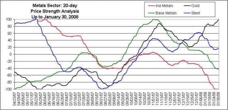
Figure 1
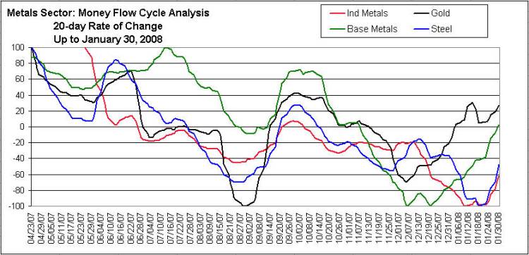
Figure 2
2. Stocks comparison within a sector
The comparison between different stocks within a sector is rather straightforward: When a sector bottoms out, I prefer to pick-up a stock that has experienced a good accumulation by large players. For example, for the different base metal companies below, I'd prefer (and actually bought in January) TCK and BHP.
Click on the left side bar to find the up to date figures.
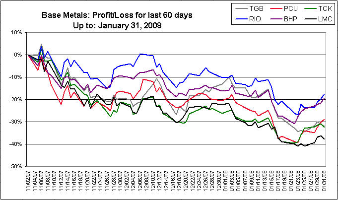
Figure 3
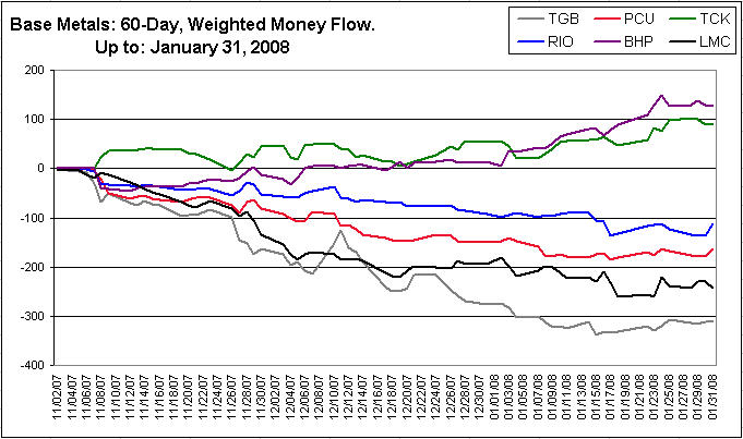
Figure 4
