-
05/17/2013 Quantifying Bernanke
From: http://market-mousetrap.blogspot.com...-bernanke.html
Last week we looked at the Shiller Yield (i.e. the inverted Shiller CAPE ratio) to see that it is accurate in predicting the average S&P gains over the next decade. We also saw, however, that accurate over ten years is practically useless for any kind of market timing.
Now I want to look at something that is USUALLY more accurate, but has been thrown wildly off track by Quantitative Easing.
Some long time readers will remember this previous post on demographics:
http://market-mousetrap.blogspot.com...xlf-iau-8.html
On that post I gave a demographic limit for 2012 at 1346.55.
The 2012 average was a little higher at 1379.35. A little higher is enough to break the model, because that 1346.55 wasnt a target, but a limit. The S&P price violated the limit, and therefore that model is broken.
That raises two questions for me. What broke it? And, how badly did it break?
For some background into demographics and P/E ratios, there is an excellent source here:
http://www.frbsf.org/publications/ec...el2011-26.html
On that site is a downloadable spreadsheet to show their methodology:
http://www.frbsf.org/publications/ec...el2011-26.xlsx
The problem with P/E ratios is that they tell you nothing about P if you dont know E. Just looking at the chart would lead someone to short the market heavily on the assumption that earnings couldnt possibly accelerate fast enough to counteract the demographic deflation.
But earnings have done exactly that, and short positions continue to get crushed.
In any case, as I pointed out last week, P/E ratios can become predictive if they are flipped upside down into earnings yields. The trick is in picking your time frame and the ratio that will track it, and once that ratio is fit to the past, it can be projected into the future. If this were being used for an investment model, what I just described would be the no-no called curve fitting. So, what I am about to share cant be used in a trading or timing model. It is just a measure of how different the price to demographic patterns are before and after Bernankes unprecedented series of Quantitative Easing.
The P/E to demographic fit is typically 40-49 / 60-69. To get an expected earnings yield one would simply invert that to 60-69 / 40-49. And that is pretty good to start, but I had to do some fine tuning to get the best fit to a ten year S&P yield:
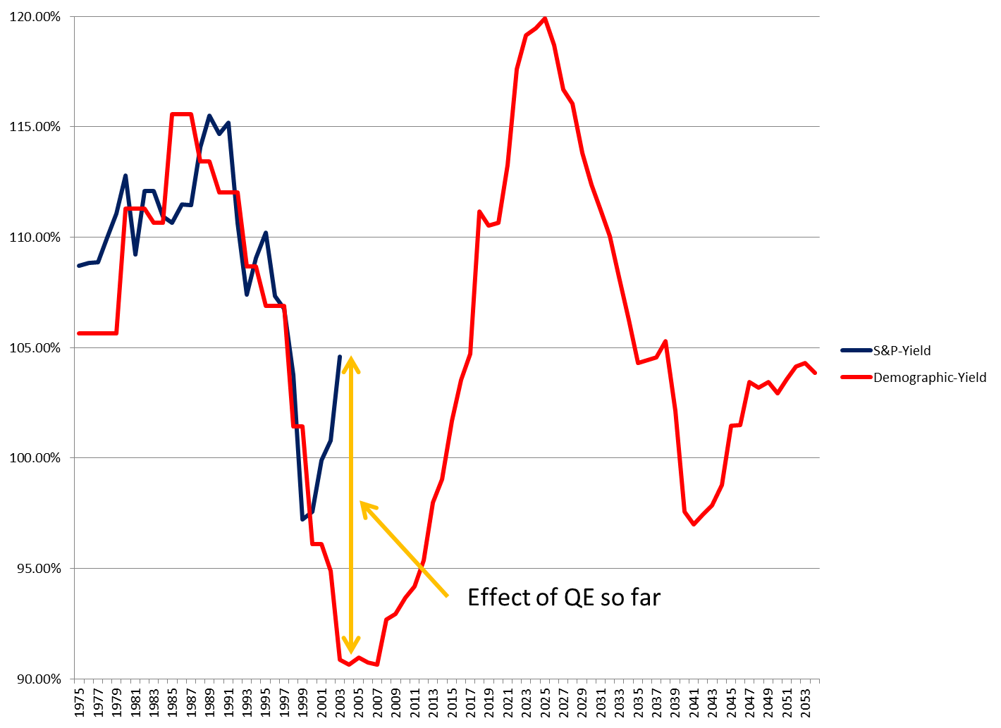
On this graph, the red line is the expected 10 year forward S&P return with a demographic ratio of 69 / 51 year olds.
From 1975 to 1999 this ratio is an excellent fit.
And then it suddenly breaks after the 1999-2009 yield.
That break corresponds to the time of Bernankes Quantitative Easing.
The ten year forward S&P price yield rises from 97.23% per year in 1999-2009, to 104.61% in 2003-2013.
In other words, instead of continuing to fall in price, the S&P started going up again.
But the demographic line continues to plummet until it bottoms at an expected return rate of only 90.64% in the 2004-2014 time range.
That translates to a substantial difference in actual S&P levels in 2013:
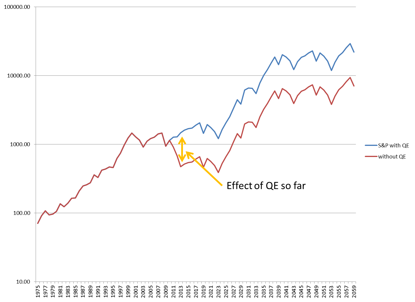
Right now the S&P is in the mid-1600s.
But without QE the demographics show the S&P hitting 470.
Thats not 1470. Thats 470; FOUR hundred and seventy.
Its called depression, disaster, deflationary implosion, bread lines (no wait, food stamps
).
And if 470 isnt bad enough, it keeps going down all the way to 390 in 2023!
The difference between present valuations and another great depression is more than 1000 points on the S&P or better than triple what it would have been if demographics were not compensated for.
The market ALL markets operate on supply and demand. The main drivers of supply and demand are the people on both sides of each transaction. Every buyer needs a seller, and every seller needs a buyer. There is supply and demand of available labor, management, innovation, collection and distribution of resources, skillsets, saving for retirement, and taking from retirement. The dark side of the 1980 to 2000 baby boom market is the present 2000 to 2023 baby bust market.
Since the supply and demand of people was deflationary, Bernanke changed the supply of something else to compensate: money.
Even though Bernanke is a stock students nightmare, he HAS stemmed the tide
so far.
The problem now is what to do with QE. Do we need to keep pumping the system until 2023 to maintain that blue trajectory, or do we simply stop ADDING and merely MAINTAIN the current levels until 2023?
Ive seen both sides of the debate, and its possible that not even Bernanke knows the answer.
My GUESS is that we merely need to maintain current levels. QE1 changed the S&P levels from the demographic projections to 140%. QE2 changed it from projections to 190%. QE3 and QE-4-ever have it at 311%.
Ive kept the blue line at 311% of the red line, but thats not quite right either, since there would be a dilution of the effect as the money supply continued to increase organically over the decades.
But we dont want to STAY on that blue trajectory either, because once the demographics stabilize in 2023 theres risk of inflation.
Wait, what? No inflation until 2023?
Uh, no. Theres inflation. Just no 1970s out of control inflation until then. This is NOT the Carter economy, but the Hoover economy hidden behind Bernankes helicopter.
So, we have to prevent deflation from 2009 to 2023, and prevent inflation between 2024 and 2034. How do we do that?
Well, in theory, THATs when you reel in that excess money supply.
1) You PUMP QE until the 2013 bottom (you didnt know this has been a bear market did you?).
2) You MAINTAIN that excess money supply until 2023.
3) You REEL IN that excess money between 2024-2034 (about 0.25% of it a week).
And it looks like this:
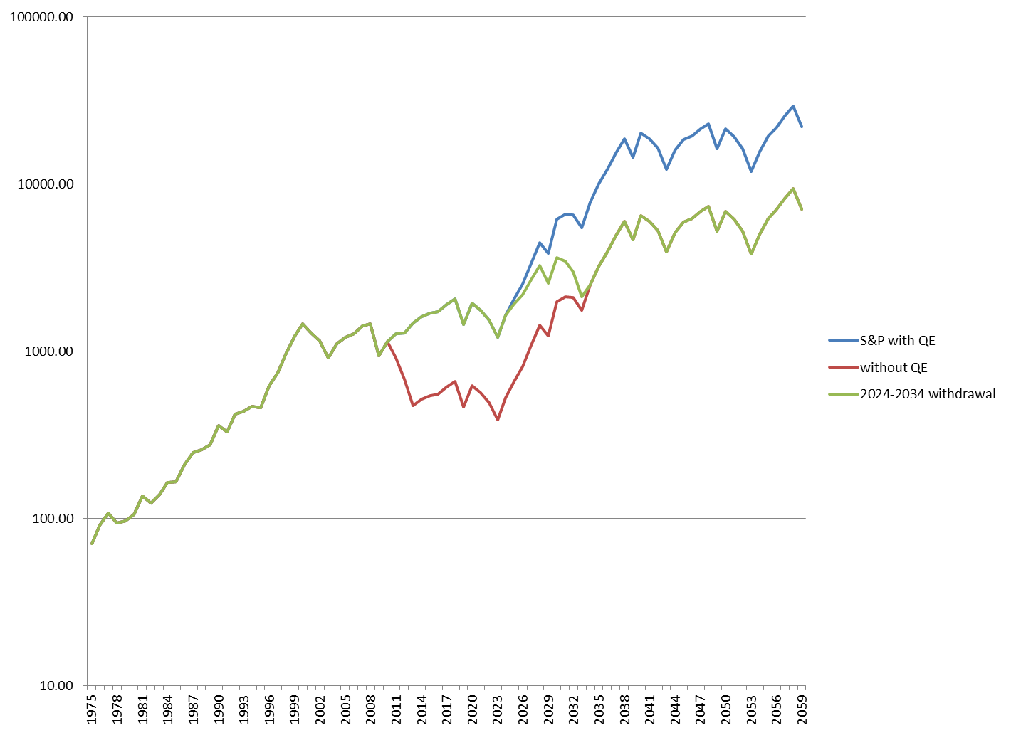
Not bad, if you can really pull it off.
Bernanke succeeded in phase 1, which was the easy part.
The progressively harder parts are phases 2 (in 2014) and 3 (in 2024).
Id retire on a high note this year if I were Bernanke, which is precisely what hes doing.
Hes a fox, that one, and a right clever one!
These effects are a lot of heavy lifting for QE. To be honest, its almost unbelievable. So, here are some caveats:
First, as we saw in the previous post, the Shiller Yield is always positive. Thats not completely helpful, since it was positive even at the 1929 top, and that didnt work out so well. Nevertheless, the S&P ten year price yield has tracked the Shiller Yield projection quite closely during this recovery.
Although supply and demand have been driven by demographics in the past, that will become less true as robotics and other automated processes create slave-labor to replace human beings. It could very well be that the demographic plunge merely forced companies to bite the bullet and invest capital in automated systems NOW because they had no other choice. Although it is a huge investment up front, it pays off afterwards. Thus, the plunge in 2008-2009 could have been the transitional point as capital investment overcame earnings, and the 2009-2013 run-up could be the payoff, with earnings blowing through the roof.
A good introduction to the concept can be found here:
http://www.technologyreview.com/view...-middle-class/
So then, lest we pop the Champaign over earnings, we have to keep in mind that robotics only positively affects the SUPPLY side of the economy. It ultimately erodes the DEMAND side of the economy. The present earning margins may simply be propped up by all of that deficit spending keeping the demand side of the economy on life support.
But thats unsustainable. The earnings are only temporary and can last only so long as money is being given away for consumers to spend. Its basically the same as if you get a woman to agree to marry you with an engagement ring you bought with HER credit card. The romance will end as soon as she gets the bill.
So, with these caveats in mind, Im sticking with my QE theory for now.
To close, we are still left with an unanswerable question: what happens when the music stops on Dec. 31, 2013?
Bearish case: Bernanke will be gone. QE3 and perhaps even QE-4-ever will be gone as well.
Bullish case: the demographic projections are both bullish. The with QE projection merely continues a bull market that should finally start a life of its own. The without QE projection shows an end to the bear market sector configuration Ive noted in numerous posts, and the beginning of a normal cyclical bull.
On my sector model, weve continued to crawl through a bear market configuration since April 2011 (just before I gritted my teeth and launched the models with real money). We are currently around the 3rd to 4th stage of a bear market, and on the brink of a bottom.
Yes, yes, I know its bizarre to talk about a bear market with prices going through the roof, but thats been Bernanke to a large extent. The market SHOULD be ready to climb on its own now for a few years.
None of this, and I mean NONE of this, is tradable. QE has kept countless market timers up at night in cold sweat.
But the alternative has kept Bernanke up at night.
2014 is as good a chance for him to retire as hell ever get. Then it will be someone elses problem. The Democrats will want to pump money too long. The Republicans will want to reel it in too soon. And once again only the Fed can save us.
Lets hope Bernankes successor is as gifted, or lucky, as Ben has been.
Tim
-
Tim,
This post was one of the best I have read.
Great research really!
Pascal
-
 Posting Permissions
- You may not post new threads
- You may not post replies
- You may not post attachments
- You may not edit your posts
Forum Rules


 Reply With Quote
