NYSE Coaction
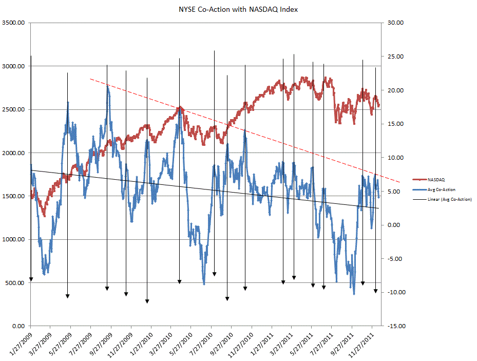
The chart below shows the 50-day moving average of the percent of stocks moving up minus the percent of stocks moving down each day on the NYSE. The NASDAQ index is shown on the same chart. At Co-action points above zero more stocks have been moving up than down over the last 50-days. The 50-day average is chosen because it is well behaved and much less volatile than a shorter average. Even with the long average it appears to be prescriptive for where markets top and bottom very near the day of the top or bottom. I don't know why the down-sloping highs behave like they do. But in the beginning of the 2009 rally it appears the first couple of pushes up were with increasing exuberance and that as the bull rally wore on that investors were more cautious and less likely to go all in.
Right now we are making higher highs and higher lows on the NASDAQ, the definition of an uptrend. If we were to enter a new bull market rally I would expect to see co-action like the left side of this chart and not a continuation of the right side of the chart. So this is to me a way to distinguish whether we are in a bear market rally or a new cyclical bull market. A NASDAQ break above the 200 day moving average with the co-action line breaking the downtrend would be the indication of this.

Mike Scott
Cloverdale, CA


 Reply With Quote