-
SPWR
I received the following question regarding SPWR.
I will use this as an opportunity to remind how to use these EV/Supply charts.
"SPWR stock has just 41 Million float and has avg daily 50 day avg of 4 million with an ROE of 110% and increasing quarterly EPS and Sales. I believe that my position can be increased based on the analysis of supply and demand.
Following is my interpretation:
1. I interpret that the left side of the LEV and TEV charts(before 8/2) indicates that institutions have created large positions at higher price points.
2. The right side of the LEV and TEV charts(after 8/2) indicate that the market makers have accumulated inventory after pushing the price down.
3. Need guidance on what LEV/TEV chart indicates when it moves from 500 to 1500 with a positive slope. Does it mean a position size of 1000000 shares?
4. On this chart it does seem like LEV decreased from 1500 to -1500 in a matter of a few days. Does it mean that large institutions offloaded 3000000 shares. Or does it mean a market maker is accumulating shares at the lower price for the next move since there is possible future demand
5. Need guidance on what LEV/TEV chart indicates when it does not have a slope This is confusing. Does a horizontal line on the chart mean that buying or selling has ceased by large players or does it indicate consistent selling at that level.
6. Finally does the supply chart indicate that at the current price there is very low volume and if large players want to increase position the only way forward would be higher prices. Marketmakers have inventory and have positioned for the next higher price when buying resumes and there is another uptrend."
I understand that this member has a long SPWR position. This long position is justified by the growing ROE, sales and profits. Since the stock is pulling back, the question is: should we buy more here (or maybe should be sell some?)
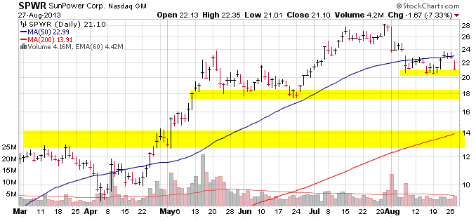
The TA shows that SPWR is now close to the $21 support, but the next support is $18. If that breaks, we will go straight to $14. To move into that direction, we only need the market to continue down and investors to cut losses. If SPWR moves down, it will not be company specific, but market specific.
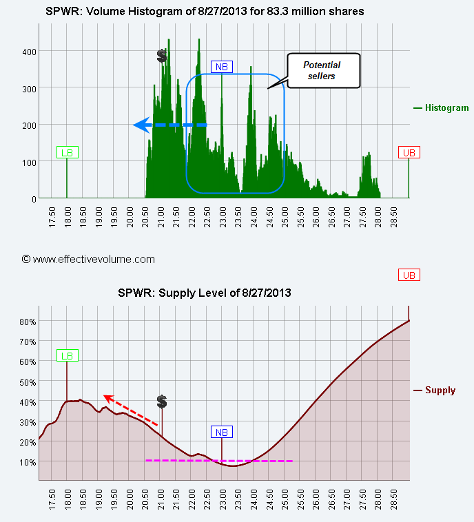
When we analyse a stock based on the LEV and Supply figures, it is always better to start with the supply.
The supply Figure first shows the Upper, Neutral and Lower boundaries. The Neutral Boundary is the place where active traders have no profit or loss. This is the equilibrium point for the stock. Below that point, selling might accelerate on loss cutting and above that point, buying might accelerate due to trend followers. Note that the NV is at $23, which is just the 50MA. This is often the case.
The Supply curve is a probability calculation that shares will be offered for sale, depending on the price/volume distribution. Usually, as the price moves from the NB to the LB, selling accelerates because traders cut their losses. The lower the float, the fastest the move. Note that the LB for SPWR is $18 and once we cross below $20.5, there is no support down to $18. A supply level below 10% indicates not much selling pressure and hence, I use to target these low supply levels to enter new long positions.
We can see on the upper panel that as me move to lower prices, the number of shares that will incur small losses of 8% to 20% will increase. This is where the selling strength will come from.
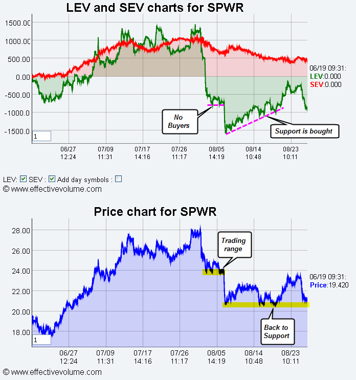
Once we know these facts, it is interesting to look at the EV pattern.
It is important to know that the EV pattern does not show the strength of a move, but represents an equilibrium between large buyers and large sellers. It is best to use it when the price is either in a trading range or is moving back to support (or resistance.)
Even if institutions bought positions on August 2, these positions could easily be cut back down, but I believe that those who bought at $28 are "locked-in." They probably cannot afford to take a 20% plus loss.
When the chart indicates a move from 500 to -500, this is a 1000,000 shares selling power. Compared to the total volume exchanged during that period, this selling pressure is about 3% to 8%. Of course, we do not know if these are funds, market makers, algos, etc. We basically should not care about that.
When the LEV pattern is identical to the price pattern, then there is no additional information to gain from EV.
SPWR is in great danger here and I would not increase the long position, except if I see buyers coming in at $20.5 or $18. This of course depends on the pain level one can endure on the present long position.
In summary:
- You buy when the supply level is below 10% AND EV shows accumulation.
- You short when the price is below NB, the supply level is higher than 10% and EV is negative.
 Posting Permissions
- You may not post new threads
- You may not post replies
- You may not post attachments
- You may not edit your posts
Forum Rules


 Reply With Quote