-
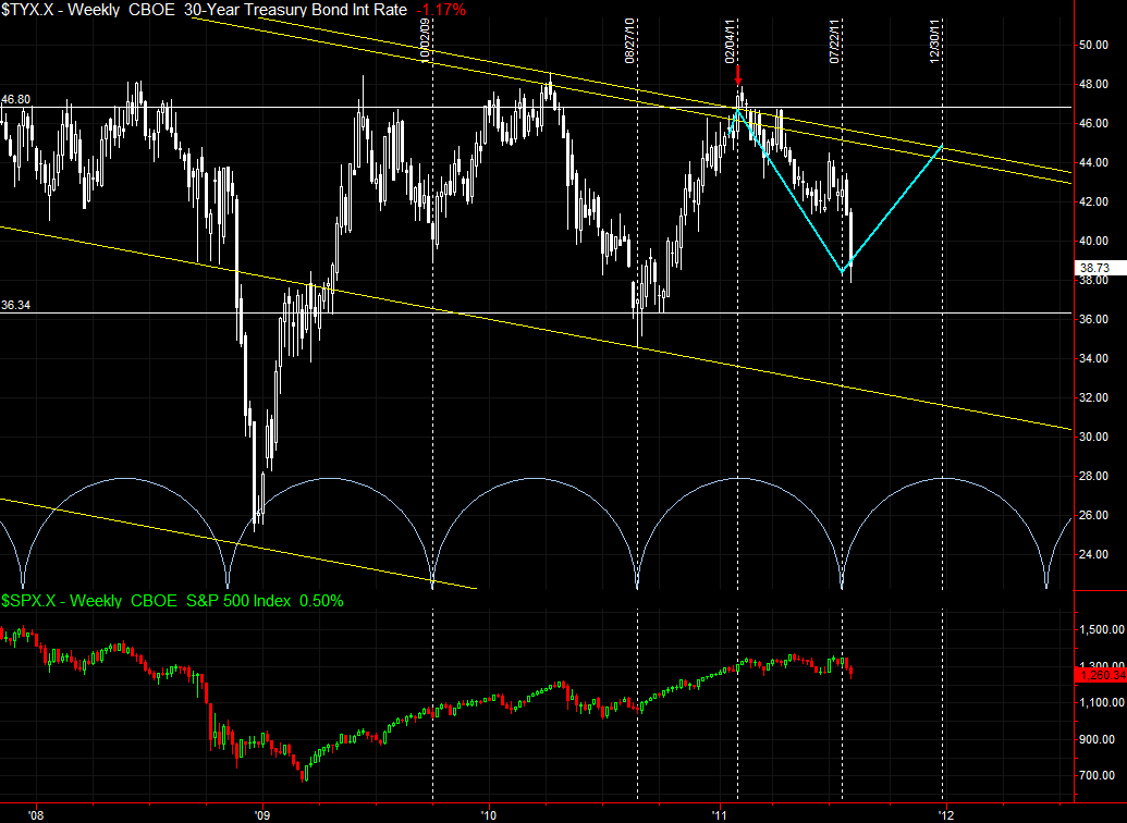
30 Year T-Bonds - Intermediate term trend change imminent?
I don't think I posted this chart here before, but I created it on February 9, 2011 and it has proved remarkably prescient. It might be partly luck, but I post it here for anyone interested in interest rates.
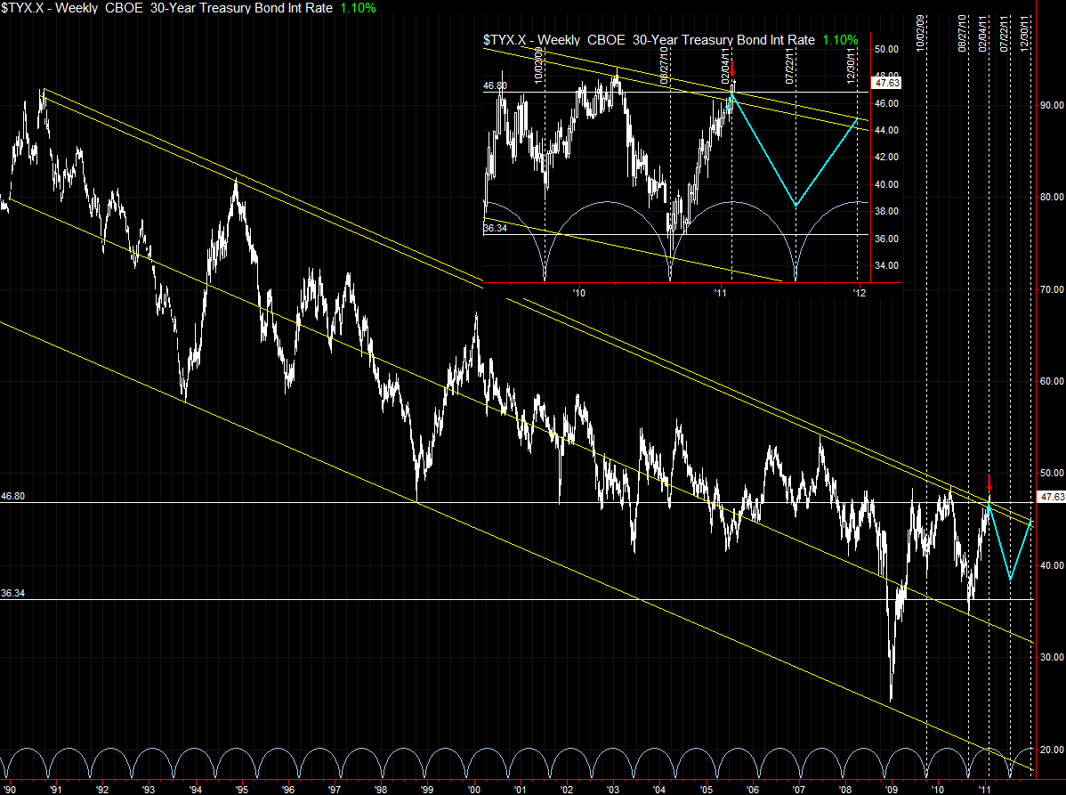
Here is the original from February, which contains more history in the monthly:
Implication for equities? Not sure, as I expect continued decoupling of yields with risk markets, as the US debt rating becomes more and more of an issue. Intermediate term implications for US Treasurys are bearish, however, assuming the cycle continues to hold. Once yields definitively break up through the downward trend channel, that marks the end of the three decade secular bull market in Treasurys (bear market in yields). It could be as soon as the end of 2011. Or, we might see another intermediate term zag downwards into H1 2012.
 Posting Permissions
- You may not post new threads
- You may not post replies
- You may not post attachments
- You may not edit your posts
Forum Rules


 Reply With Quote