+ Reply to Thread
Results 1 to 6 of 6

Thread: Cont'd from archive: POMO Oscillator

  1. #1

    Cont'd from archive: POMO Oscillator

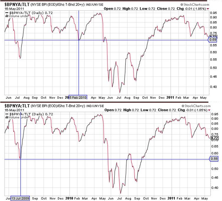
    Below is the simple ratio of the Stockcharts.com NYSE Bullish Percent Ratio ($BPNYA) divided by the share price of the TLT long-dated US Treasury ETF through today, which I referred to as a "POMO Oscillator" in a previous VIT post here.

    It shows the two lowest dips in the ratio during POMO-active regimes, in July 2009, and Feb 2010.
    (To repeat for those who may have missed this first time around - the ratio is not intended as a trading tool per se - our hosts here have that covered - but as a diagnostic for revealing market acceptance or rejection of FED Large-Scale Asset Purchase Program ("POMO") induced asset substitution effects which many believe have resulted in over-pricing of US equities in general. The search for the ratio was inspired by the practical math and active boundary concepts of Pascal's book. POMO-active periods are revealed to indulge price-to-perfection equity/long bond price behavior, represented by a bouncing-off-of-0.91 topping of this ratio, similar to an upper active boundary; while POMO-dormant periods have been erratic around the 0.40-0.60 AB-like band.)
    The ratio is approaching the first of its previous lower test levels, at 0.69. Its utility in diagnosing POMO-induced behavior would be strengthened if the 0.69 level first, or the band between it and the 0.56 level second, were to hold as support, followed by a return, however jagged or direct, to the 0.91 upper boundary. If both levels are broken downward, it would suggest that POMO-induced asset substitution effects were being unwound early - an important pre-cursor to a longer period of POMO-off volatility for equities which would likely persist until the FED signals toward some kind of QE3, or US macro data returns to significant positive surprise levels.

    As an aside to our hosts, the new forum tools and features are far superior to Google's (no offense to employees or investors of GOOG); the system response is superb, and the structure makes perfect sense. Also I'm net long with TZA (3X short $RUT), in agreement with the robot. Thanks for all this work. Well done.

    Name:  POMONearLow.PNG
Views: 373
Size:  165.5 KB
    Last edited by Ellis Wyatt; 05-16-2011 at 09:28 PM. Reason: added link; then added thanks for the forum

  2. #2

    Pomo

    Thanks for posting this figure Ellis, I have been following it when you posted in the past, but with Google, it is so difficult to dig out old posts that I could not find it anymore.

    And thanks for your comments. I hope that more people will find the environment friendly enough to post.

    I believe that we still have an issue with messages notification.


    Pascal

  3. #3
    Thanks Ellis.

    Pascal, with Google I found it rather easy to keep track of good posts with the "star" feature. Is there something similar available in this forum? I think there will be a lot of valuable ideas here, one would not want to lose.


    Regards

  4. #4
    This ratio is only updated once a day, so it cannot be said to "tick." It would be more accurate to say that yesterday's 0.69 held to the basis point, and reversed up today to 0.70 (0.696 if un-rounded). Anything could happen next, but on the grounds of a full day bounce, I'm labeling 0.69 on this update as S2. The lowest POMO-active excursion to 0.56 will become S1 if validated, or not if violated.

    The reversal also reflects and affirms Pascal's calls on both the USD and TLT of yesterday, with the TLT's > full point stair-step decline today (-1.28) the largest contribution to the ratio bounce. Three general paths from here could be characterized as 1) Strong continuation suggests POMO-inducement to risk has not reversed just yet; 2) weak continuation over multiple days involving a re-test of 0.69 would suggest a battle may be joined between FED bears and bulls (I think most likely of three); and 3) should this turn out to be a one-day zig, followed by a violation lower, then the next update will be upon any approach to 0.56 (which would make TZA holders very happy), or sustained rise above 0.69.

    Name:  POMOS2.PNG
Views: 308
Size:  48.9 KB

  5. #5

    The last POMO support level

    In retrospect, determining the end of the POMO effect did not require any additional indicators than price. The POMO oscillator has now reached its all-POMO-on low. There is some reason to suspect we may get a bounce in equities next week, being OpEx and playing for max pain, but the Bullish% and TLT are telegraphing that the end of POMO, coincidentally timed with the lowest negative economic surprise index readings since 2009, herald the return of the long beta-blockers / short dexadrine convergence trade:

    Name:  POMOS2.PNG
Views: 269
Size:  83.9 KB
    and a link to the same:
    http://stockcharts.com/h-sc/ui?s=$SPX&p=D&yr=2&mn=0&dy=0&id=p96249539740

    CESIUS:IND, via Bloomberg:
    Name:  CESIUS.PNG
Views: 260
Size:  23.0 KB
    and its link: http://www.bloomberg.com/apps/quote?...SIUS:IND#chart

    In closing, a POMO-effect thought experiment. The descent since May 2 has been remarkably controlled. In a highly simplified variation of Bob's Reverse VWAP, imagine what the SPX chart would look like if the last buyers in were the first sellers out. Here is a non-technical imagery experiment showing the SPX from 9/1/2010 to 5/2/2011, but mirror-inverted. Overlaying it, is the SPX in regular time sequence since May 2, slightly elevated in the vertical to make the candles visible.

    Name:  OMOP.PNG
Views: 229
Size:  215.7 KB

  6. #6
    Join Date
    Dec 1969
    Location
    Montreal Quebec Canada
    Posts
    55
    Quote Originally Posted by Ellis Wyatt View Post
    Here is a non-technical imagery experiment showing the SPX from 9/1/2010 to 5/2/2011, but mirror-inverted.
    You are mad ...... [Just kidding...]

+ Reply to Thread

Posting Permissions

  • You may not post new threads
  • You may not post replies
  • You may not post attachments
  • You may not edit your posts