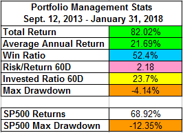
Below are a few statistics about Portfolio Management method.
The update of these stats has ended on March 2021, although I still continue trading my portfolio.
The
Portfolio Management shows how I trade the stocks that are scanned on a daily basis. My strategy is to buy or short deep into the buy/short zone. This allows me to keep tighter stop losses, but it also leads to fewer trades being executed.
I send by email all the trades that I execute when I execute them.
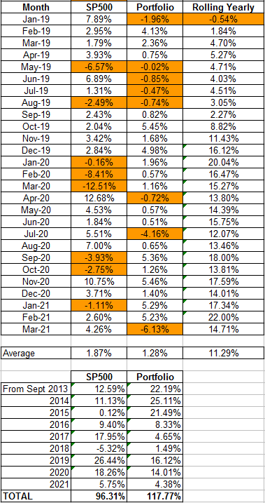
Portfolio Management Trade Statistics
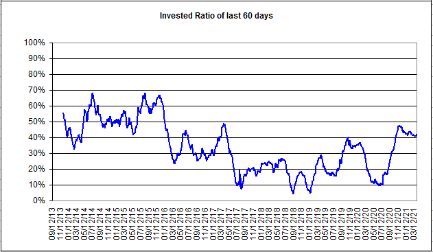
My objective is to hold five positions in the Portfolio, but on average, I hold only three to four positions. I have an investment ratio on the Portfolio between 40% and 75% (On a 60 days average basis).
Trades are held on average for 4.1 days. Each trade has a profit expectancy of 2.63% and a loss expectancy of -1.54%. This gives a positive expected return of 0.67% per trade. Between September 9 2013 and May 31, 2016, the Portfolio had a
non-compounded gain of 76.04%. We then can calculate
a Portfolio annual non-compounded expected return of 28%.
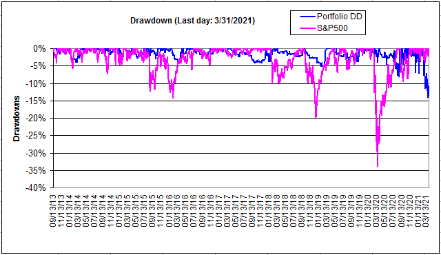
We can see below that the Portfolio produced twice the return of the S&P 500 with a much lower drawdown.
Below are the
Monthly statistics as well as the
Rolling Quarterly gains.
The last columns represents the rolling Quarterly gains on an investment of $100,000. This is to be compared to the cost of the service of $99/Quarter. On average, the Portfolio has gained 6.25% on each rolling quarter.
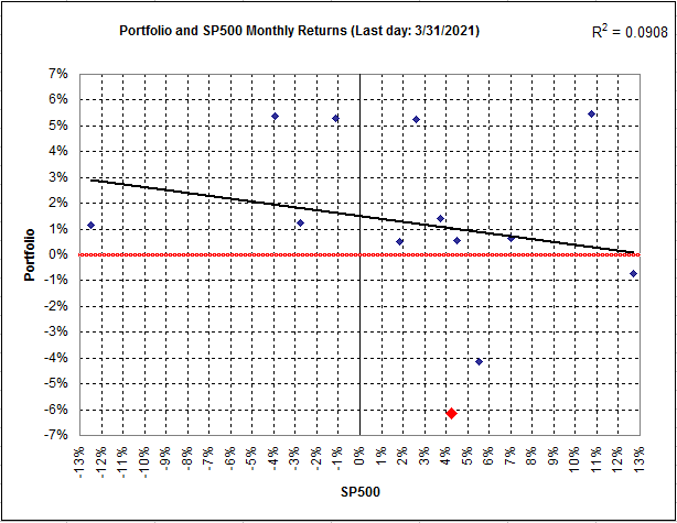
I have a few observations on the
Portfolio - SP500 correlation Figure shown below:
1. The trend line is always above 0. This means that the investment strategy has a positive profit expectation even when the S&P500 pulls-back.
2. The trend line is going upward. This means that the stronger the market, the higher our profit expectation. This also means that our strategy trades
WITH the market.
3. By pointing the most recent Month (in Red,) we can see whether we are operating above or below the trend line. You can also see whether the Month is profitable (above the horizontal red line) or not.
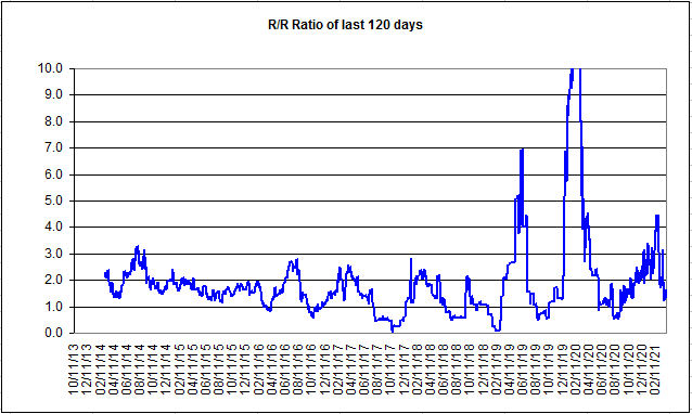
Finally, the most important measure is the evolution of the Risk/Reward ratio. A R/R ratio lower than one indicates that the strategy is losing money.
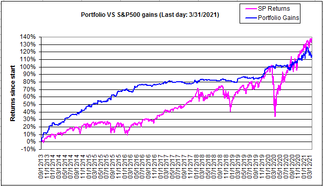
Below is the portfolio return evolution since early September 2013, compared to the S&P500.
I sometimes receive emails from non-subscribers who tell me that it is impossible to beat the leveraged ETF that followed an index. For example: TNA is impossible to beat in the long-term.
Indeed, we can see below that TNA has outperformed the Portfolio for some periods since September 2013. Why go through such a tedious work of trading individual stocks when trading TNA would make you rich without effort?
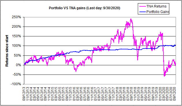
You already know the answer to this question: it is called risk of drawdown.
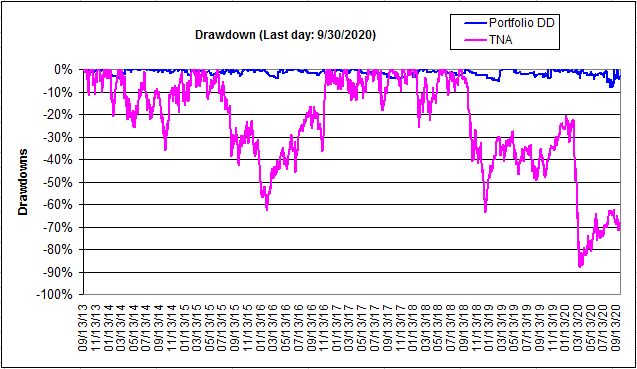
You can see below that since September 2013, the Portfolio had a Max drawdown of about 4%.
The drawdowns on TNA are however much larger. Can you manage a 60% drawdown? Usually, a trader would sell much before. Maybe at 15%. In such a case, how do you re-enter the TNA position?
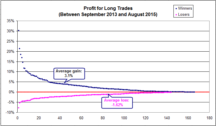
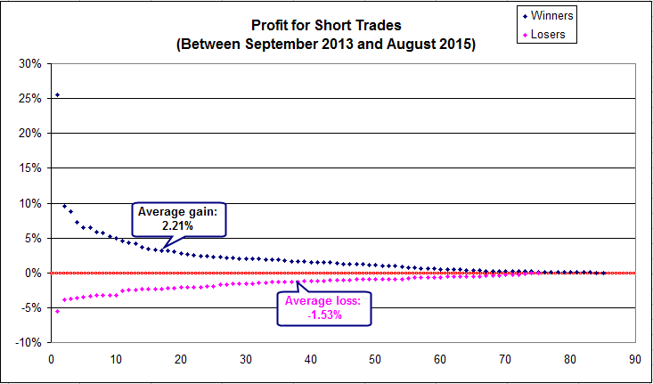
I have also added below two Figures that show the
profits and losses on all the trades that were executed for the past two years, separating long and short trades.
A few notes:
1. There are slightly more blue than pink dots. This means that the stock selection process has a slight positive profit expectation (the win/loss ratio is 53.9%)
2. There are more long than short trades (because during that period, the market was more bullish than bearish)
3. The average gain is higher than the average loss. This is more evident for long than for short trades. (also due to the market's bullish aspect)
4. The most important element of this strategy is that there are comparatively many more large winners than large losers. You only need to see the number of traders than gained more than 5% compared to the number of trades that lost more than 5% (This is because I prefer to exit a losing trade early before losses can grow)