Click here for an explanation of the "signal" columns of the table below.
Click here for a list of available stocks for each sector
Click here to download the UPDATED Excel version of the table
Comparative Sectors Table
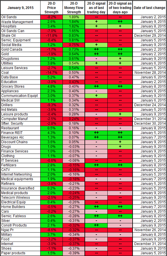
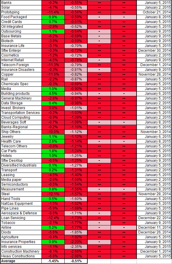
The different sectors are ranked by decreasing Money Flow. The idea is that you will look at sectors that are on the top of the table to invest on the
long side. The sectors that are the most attractive for
short plays are to be found at the bottom of the table.
The 20-day price strength varies between a top cycle of 100% and a bottom cycle of -100%. The green color indicates a price strength that is above 0%.
The Money Flow represents the percentage of the Money Flow balance during the last 20 days, compared to the total money invested in the sector. Because markets are very efficient, this percentage is usually below 5%. The color code represents where the Money Flow balance is located compared to its past cycles. A green color indicates that the Money Flow balance is at the top of its cycle. A red color indicates that it is at the bottom of its cycle. A pink color indicates that it is neither at the top nor at the bottom.
A top cycle in the Money Flow balance indicates real buying. This is usually a good sign for the stock price. A bottom cycle indicates profit-taking. Since large funds need much time to get out of their positions, buying or profit-taking may sometimes not translate itself into a price move. It is however unwise to bet against large funds.


